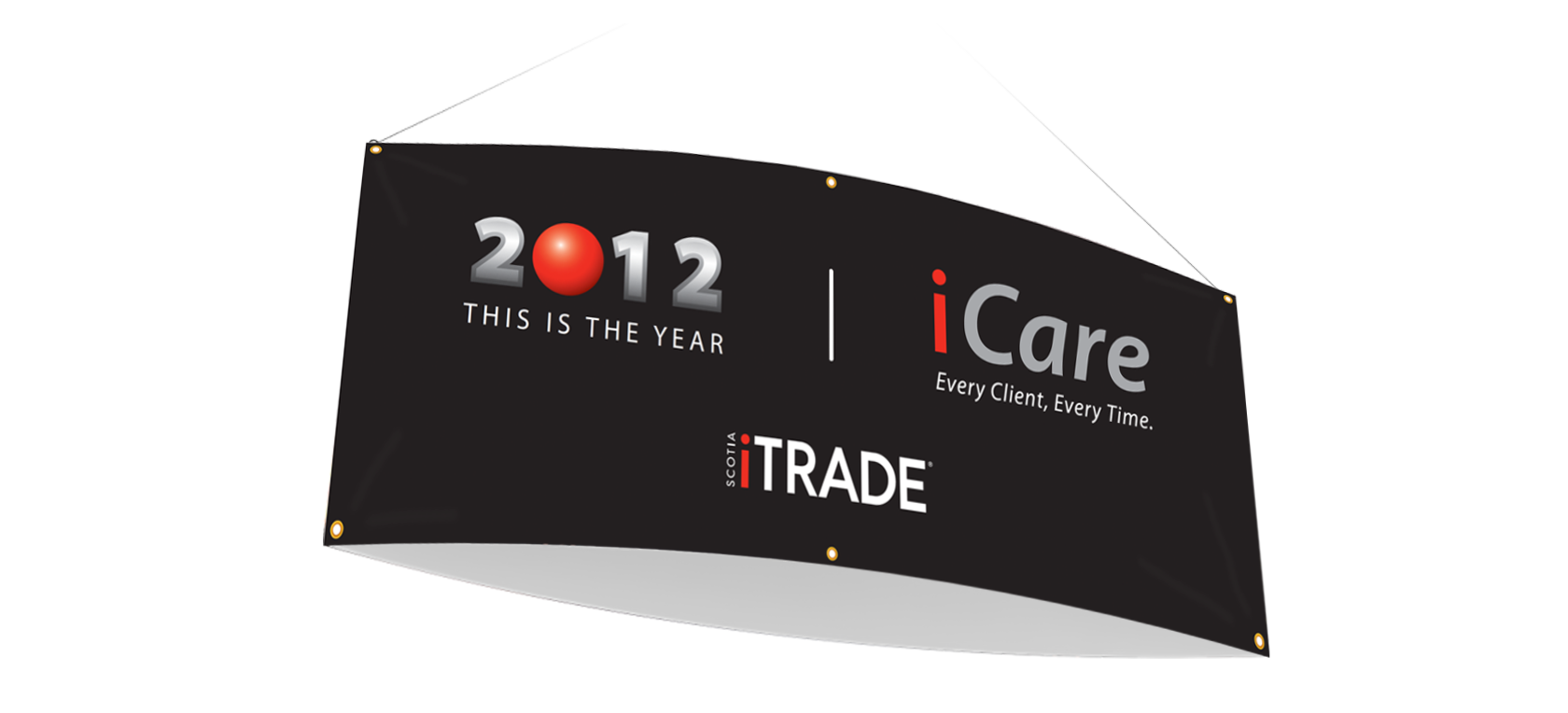
Logo Design • FRINGE
In tandem with the business owner, I helped design and develop an identity package that included final logo variations and a brand colour style guide for the startup business; FRINGE – Marketing & Business Solutions. The final assets included logo artwork for black & white, reverse and horizontal use as well as a PDF showing primary, secondary and tertiary colour palette combinations and descriptions of their use and purpose.

Conceptual Development
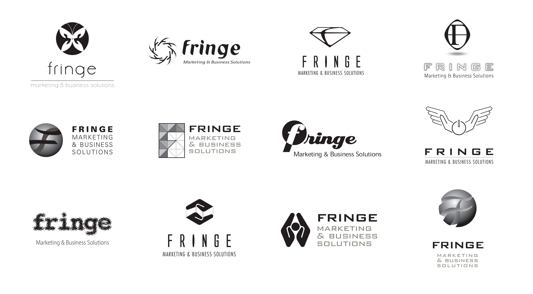
Logo Design and Branding Guidelines • Hot Water Ottawa
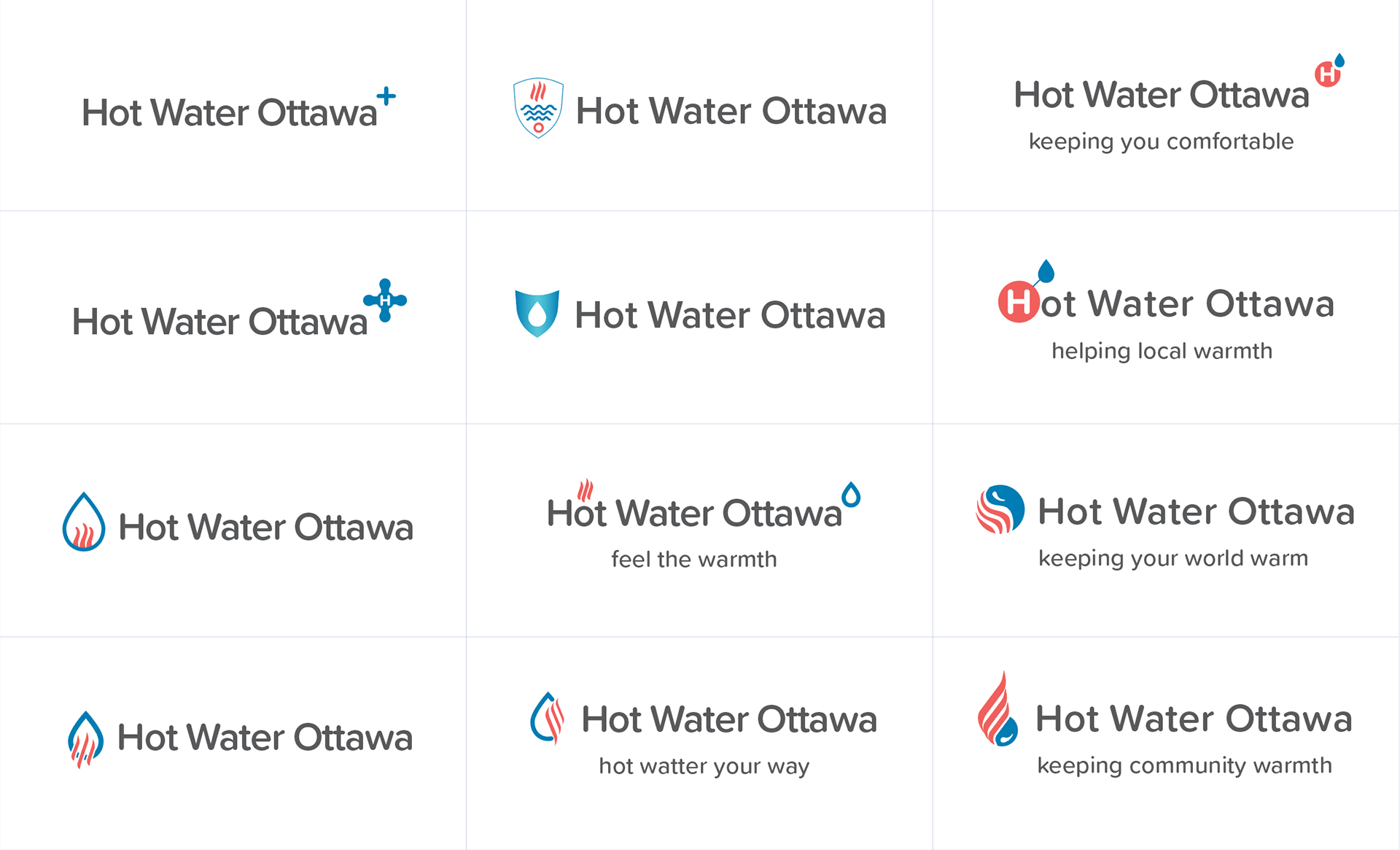
Collaborating with Fringe Marketing & Business Solutions I was able to develop a variety of logo concepts to build on a parent company brand for Ottawa Home Services. With the direction to keep the parent company font I was able to brainstorm a variety of designs and some potential taglines. The logo and tagline is now used on a variety of their marketing materials.

Logo Design
Conceptual Development
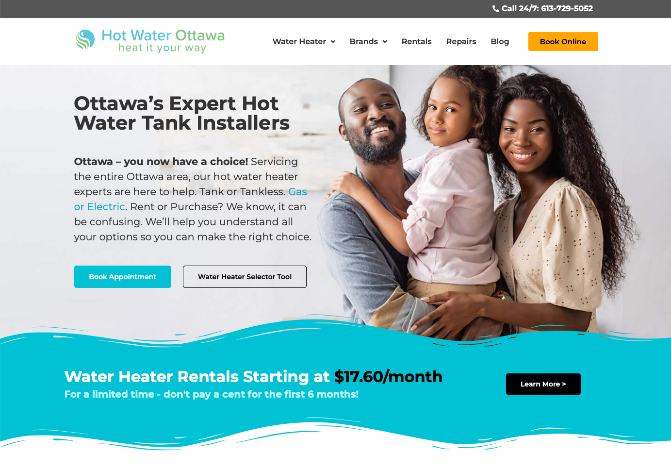
Logo on website
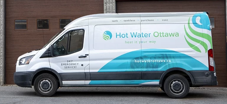
Logo used on vehicle branding
Product Offering Guide • SeaSpine
Working together with the product development team at SeaSpine I was able to create a new template and sales catalog that had a complete inventory/guide to all their current product offerings. The guide previously was nothing more than an excel spreadsheet; so, I was able to take the existing format and elevate it into something that made it more of a sales aid showing inventory support for the new Surgical Technology.
Logo Design & Brand Development • Sparkling Tornado Cleaning Services
Collaborating with a small business owner, I helped design and develop an identity package for Sparkling Tornado Cleaning Services. The final deliverables included logo artwork and some initial deliverables in the form of Business Cards and Postcards for Door-to-Door distribution.

Brand Identity

Business Cards
Trade Show Booth Graphics • Reach Stack
Collaborating with my client at Reach Stack, I was able to come up with a design on short notice for the following Trade Show booth. I was able to obtain the appropriate specifications from the kiosk manufacturer and design graphics for all panels while leaving space for a video monitor.
Corporate Branding & Design • Straight Blast Gym
Collaborating with the business owners I've helped design and develop a variety of marketing materials for Straight Blast Gym operating out of Atlanta & Buford locations. This includes a wide variety of Print and Social Media communications. Below is a small sample of a much greater range of communications and in gym advertising I've assisted with.
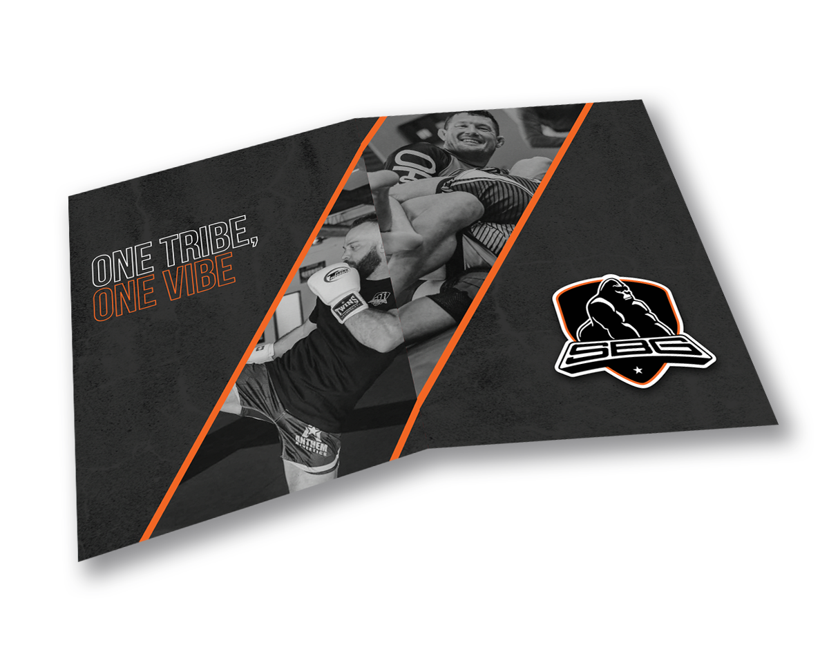
Onboarding Folder Outside
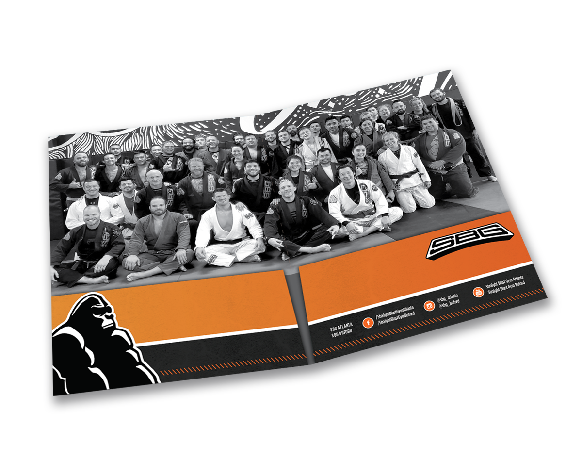
Onboarding Folder Inside

Poster

Instagram Graphic

Facebook Event Cover
Presentation Design • Various Corporations
Through creating hundreds of presentations over my career it's taught me to stay calm under pressure. Immersing myself in the content has helped make me a better designer and creative person. Through this unique creative and communications process it's allowed me to develop left and right brain thinking (creative and analytical).
From Sales roadshows to large Internal Communication Town Hall presentations and keynote events, I've been a part of many different scenarios where my skills have helped elevate communications beyond design to help in the content development and evolution. Working directly with sales teams, executives and communications team leaders I help bring reassurance that their show is in the hands of a professional.
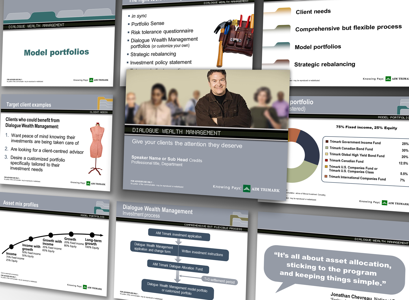
Dialogue Wealth Management Sales Roadshow
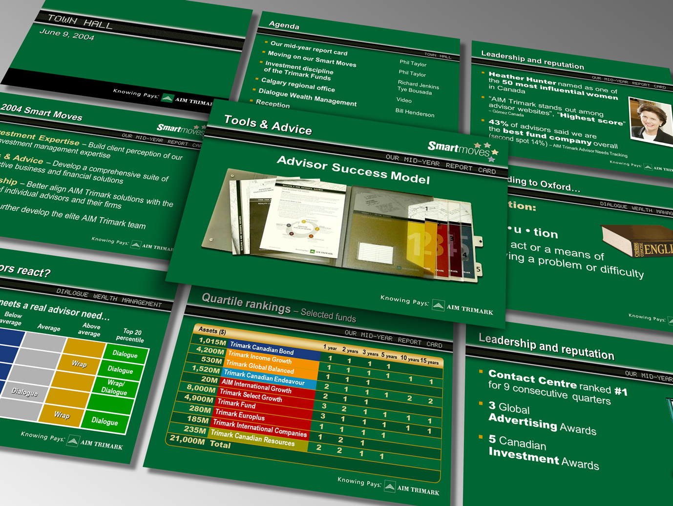
AIM Trimak Town Hall 2004

Invesco Town Hall 2008
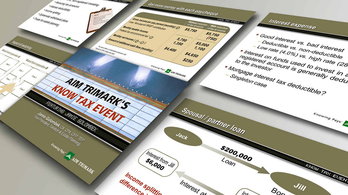
Jamie Golombek's Know Tax Event
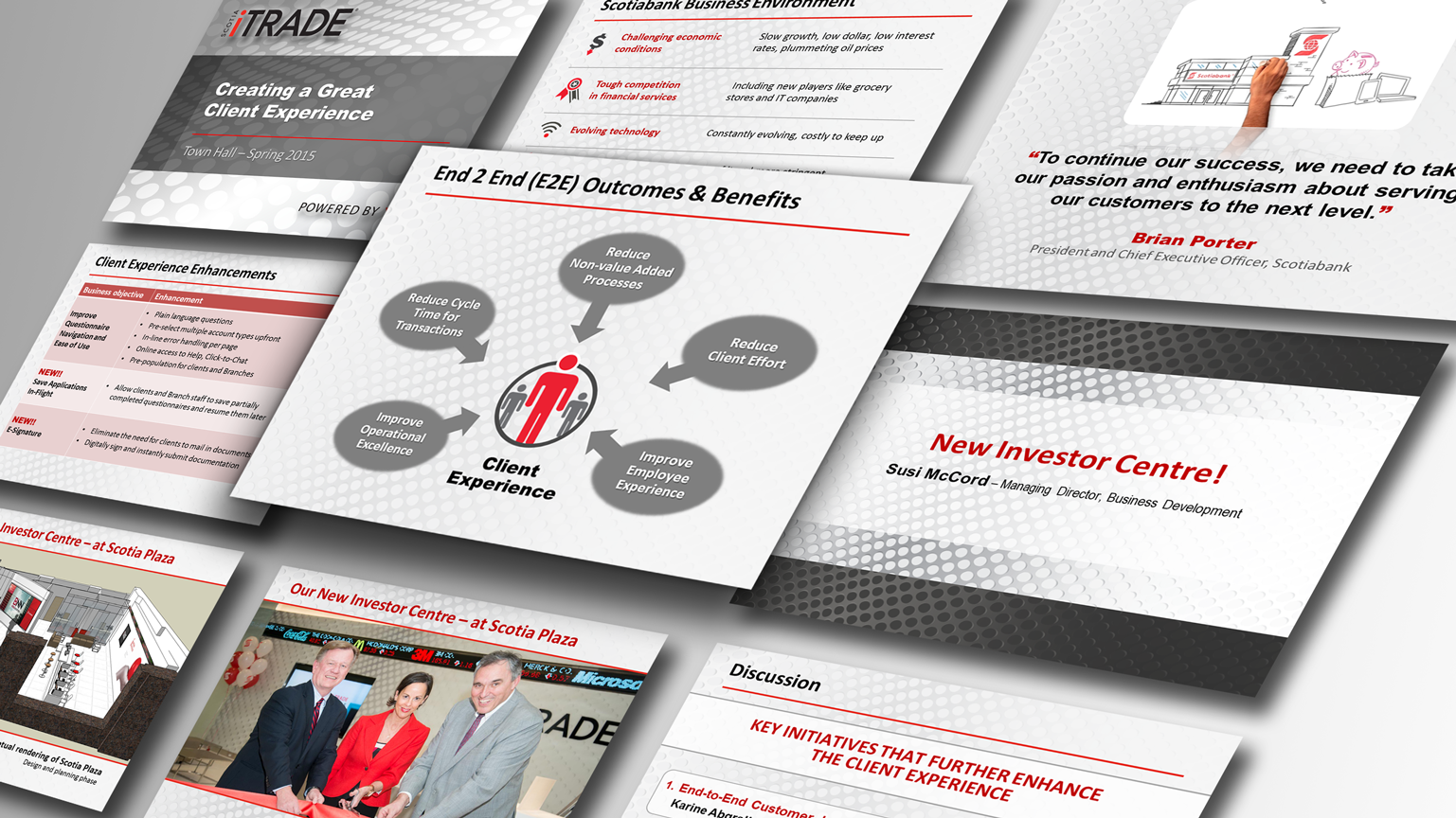
Town Hall for Scotia iTRADE 2015
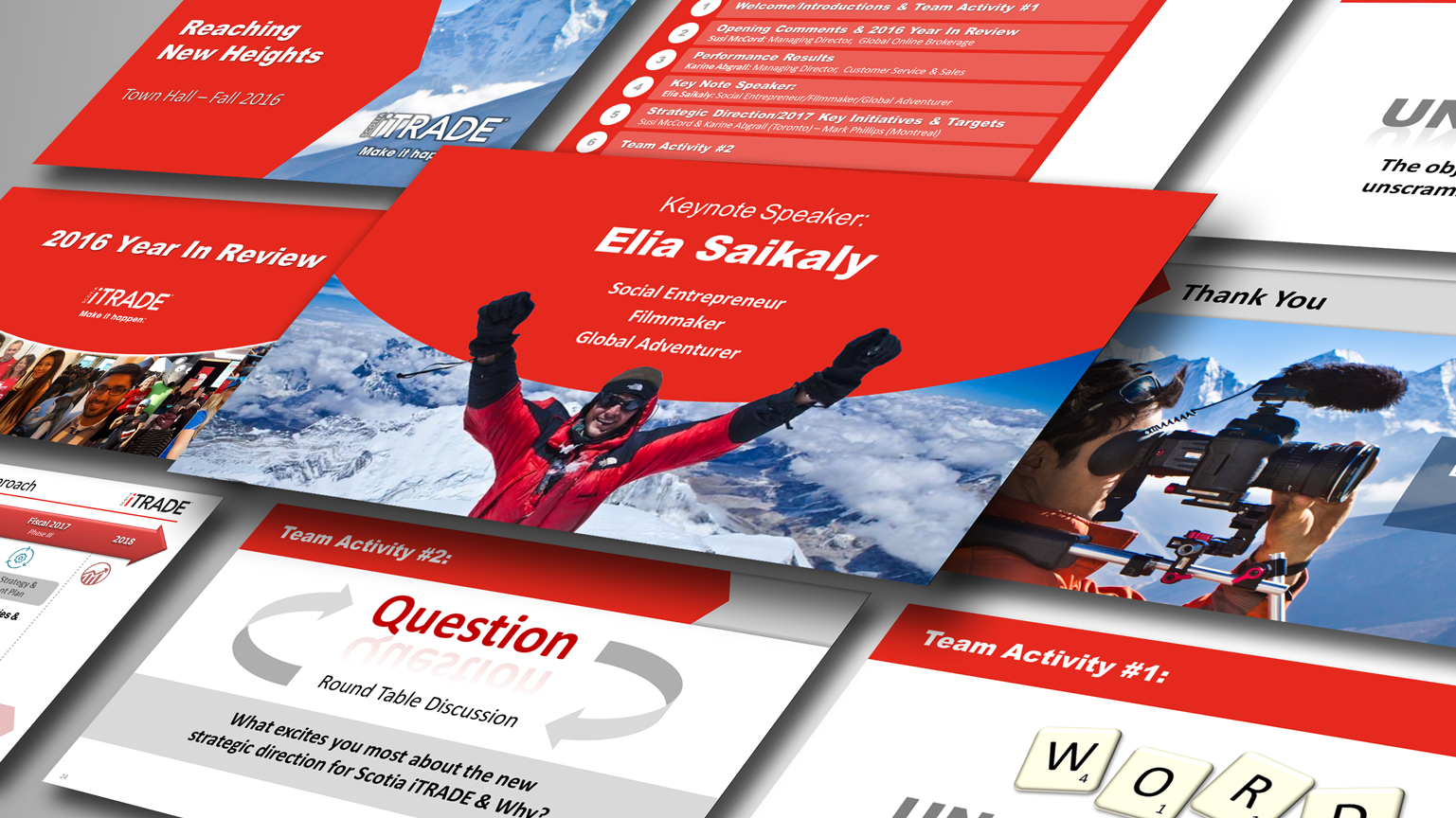
Town Hall for Scotia iTRADE 2016
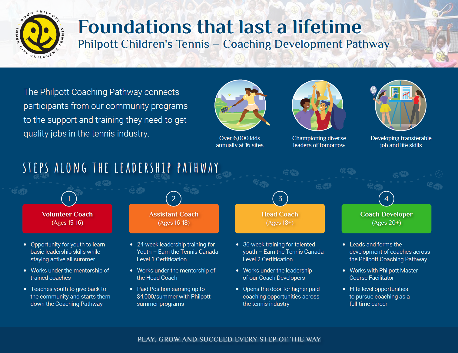
Graphics and Annual Report Design • Philpott Children's Tennis
Working with the Charity Director and Communications Coordinator I've created a number of graphics and assisted with their Annual Report. I've donated my services as my way of supporting their fundraising efforts. They have a fun brand to design around and I have the opportunity to feel great about helping.


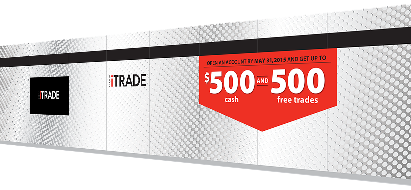
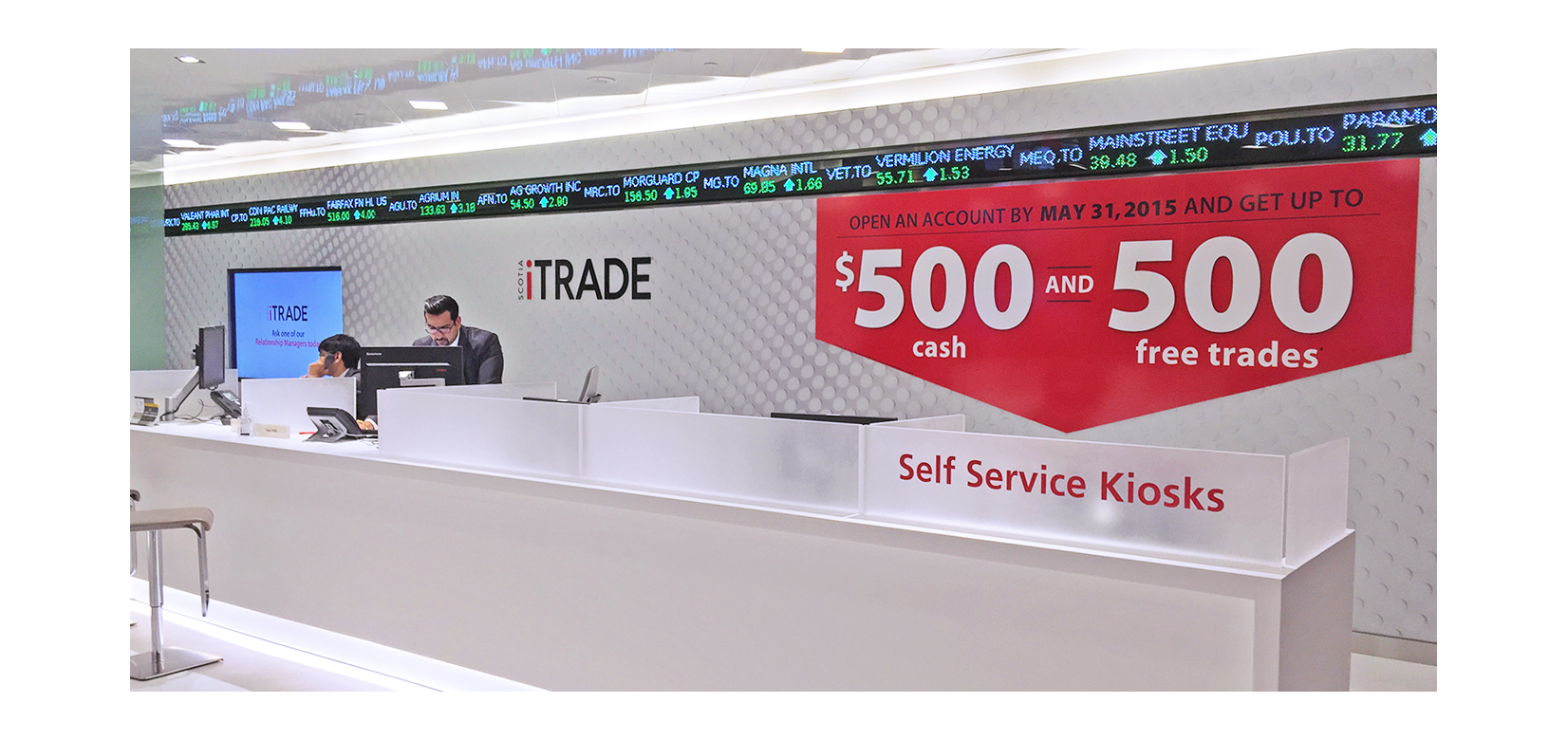
Concourse Environmental Graphics • Scotia iTRADE
I played a lead role collaborating on the design and implementation of not only the advertising vinyl; I also designed the environment graphics imbedded in the glass that are still in place years later. Following the opening launch I also designed many campaign ads that were over-laid on the glass for seasonal campaigns and special offers.
Logo • University of Toronto – Hart House Catering
I designed a new logo word mark for Hart House catering business which is poised to extend their service offering across the university with additional future growth potential. The final logo above fuses their existing brand typography with a sub category treatment for catering. To illustrate some of the conceptual evolution, an additional image shows some of the design exploration during the collaboration.

Final Logo
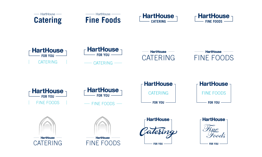
Conceptual Development
Invitation & Conference banner • 7D Surgical
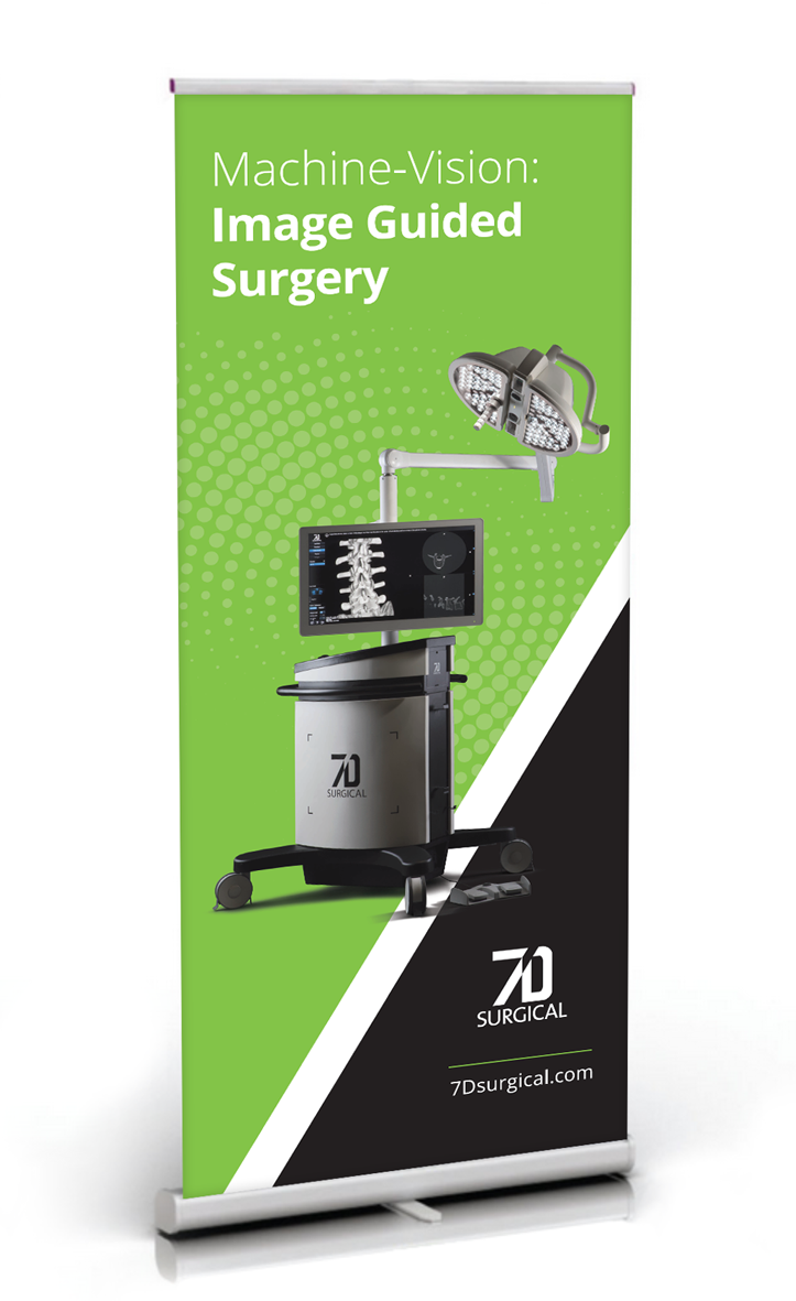
Invitation design for a new annual spine skills lab event; distributed as an email attachment and printed for direct mail distribution. Designed a generic pop-up floor banner for use at conferences and future speaking engagements.

Full Page Magazine Ads • Scotia iTRADE
Following agency created design style guides (From Capital C) our internal Marketing team created new advertising. We wrote and designed custom content for a variety of publications. I would create layouts to specifications provided and ensure the brand standards were kept consistent over years of evolution as the brand styles later adapted to more current design trends. Our Ad appearing in Maclean's Magazine was recognized for ideal balance of copy, creative and whitespace for readers.

Maclean's Magazine

MoneySense Magazine
Education Infographics • Scotia iTRADE
I collaborated with an internal team from Product Management and the Education Manager to design a series of Infographic PDFs based on a similar series of videos created by John St. (Agency). Project involved the design of icons and graphics that were also adopted in the video production.
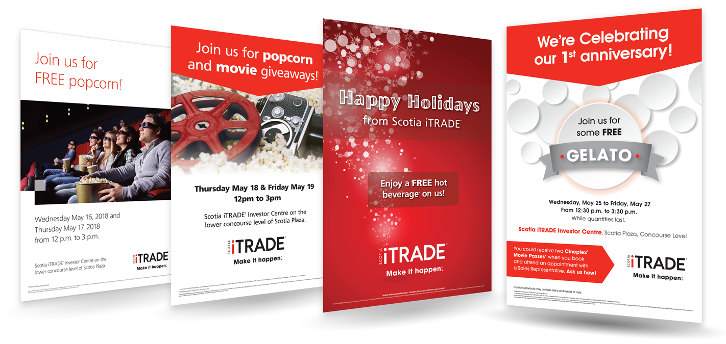
In-Branch Promotional Events • Scotia iTRADE
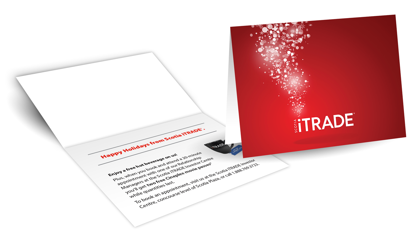
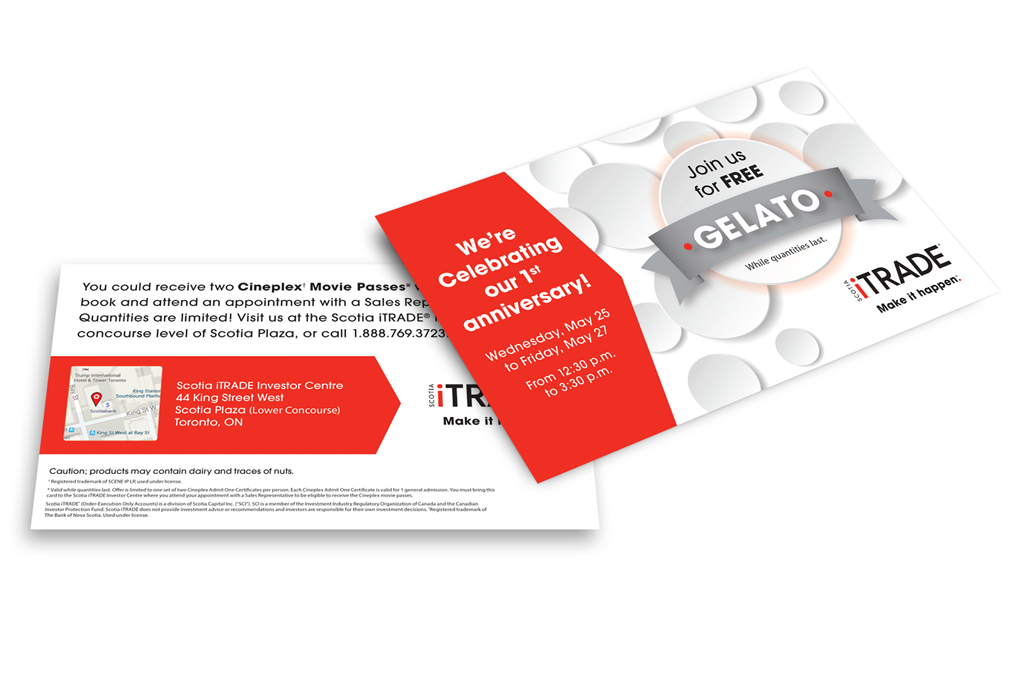
Worked with the Marketing and Communications team to design and create supporting collateral for annual reoccurring events. Designs frequently included posters, postcards and other unique items, depending on the event or promotional giveaway.
Floor Banners • Scotia iTRADE
I've designed a variety of event and sales pop-up banners in tandem with the internal communications team at Scotia iTRADE. Designed to reinforce strategic focus for on-stage and in-office display at corporate Town Hall Meetings, etc.
2012 and iCare word marks • Scotia iTRADE
I designed and developed two logo word mark designs supporting a monumental year in the evolution of the organization where three online brokerage business lines within Scotiabank merged into one brand; representing years of hard work by everyone across iTRADE. The iCare logo and tagline helped drive home our internal communications for our call centre team to be at their best and deliver consistent customer care.
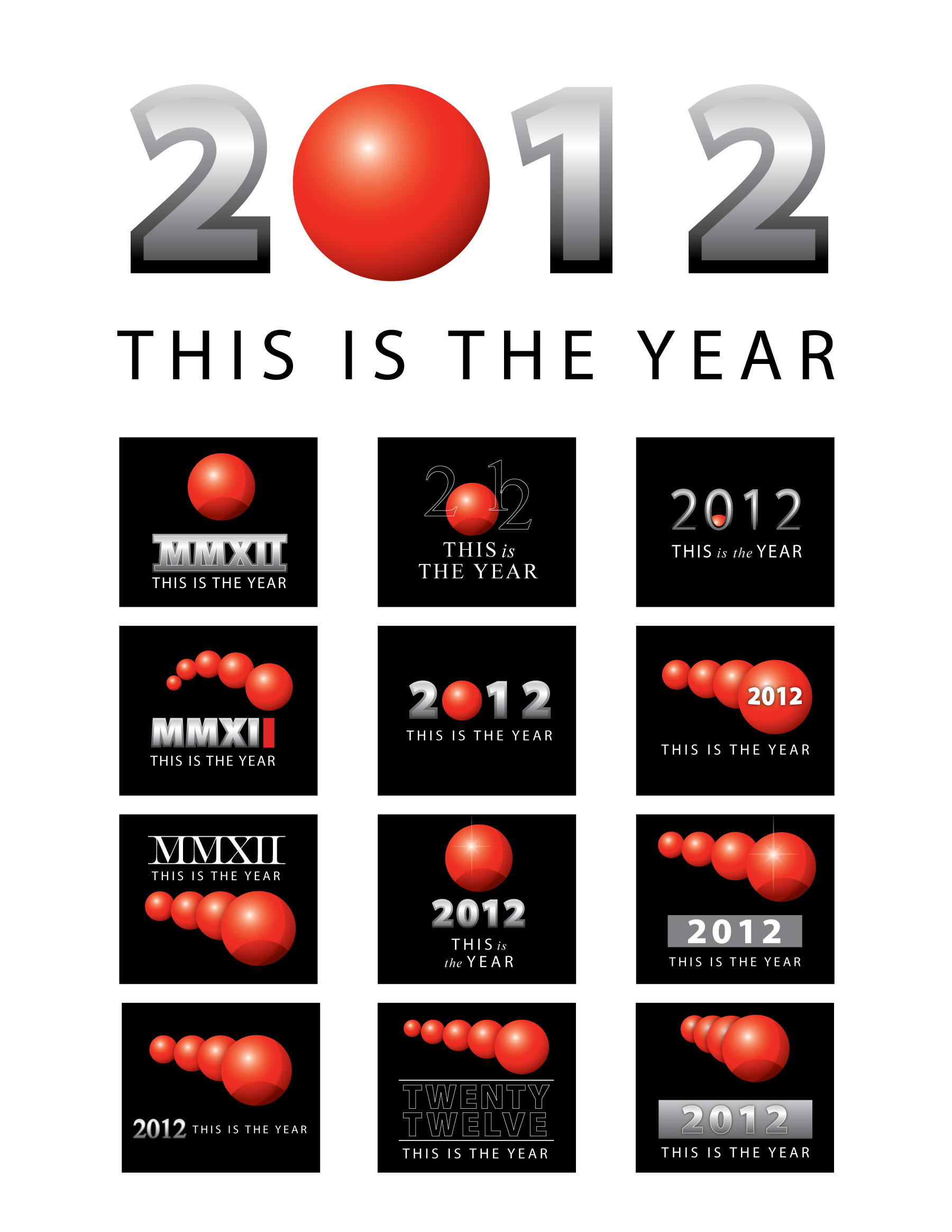
Logo and concepts
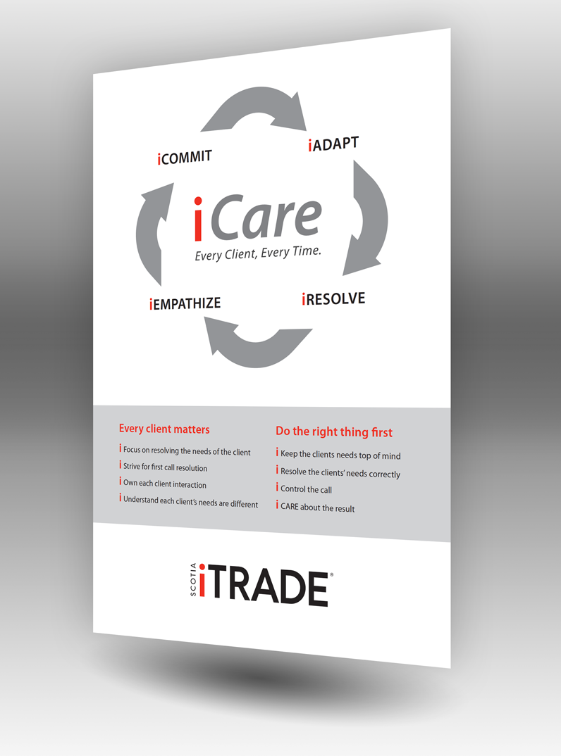
Poster
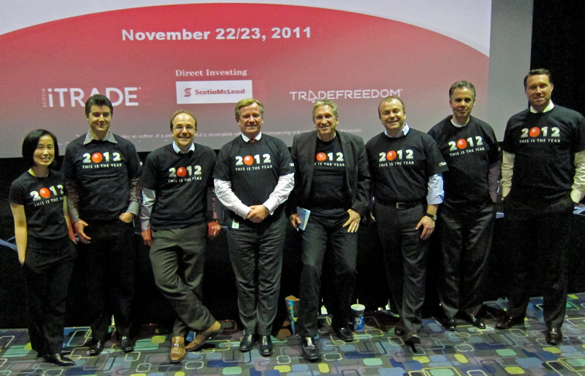
T-shirts for all staff
